ShopDreamUp AI ArtDreamUp
Deviation Actions


Suggested Deviants


Suggested Collections


You Might Like…


Featured in Groups


Description
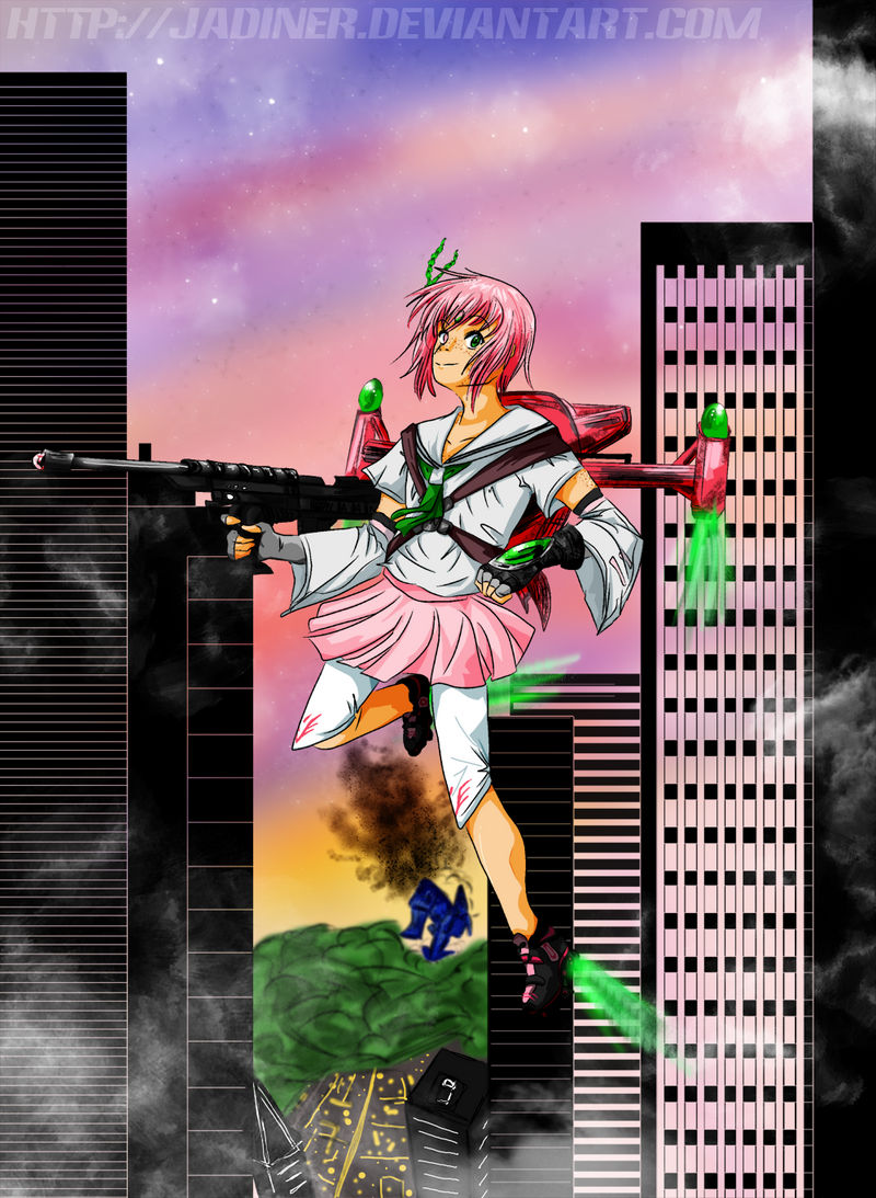
Ok, I can finally announce this....
It's my first novel cover!!!
Fantasy Island Book Publishing has just released an eBook version of 's novel, Sakuri. About two months ago, he asked me to illustrate the cover for the novel. I could not resist doing something for an old friend, especially as important as this. I was honored <3
So this is the cover featuring the main character Sakuri. She's all decked out, ready to fight!
Even now, I think it's one of the best work I've done. I don't even care whether the perspective worked here, that's how I like it XD I know I should care but on this one I really don't. It actually looks perfect to me. However I'd still love critique.
The print version will be coming soon as well, for those who are interested more in not straining your eyes looking at a screen 8D
Buy the eBook here
Sakuri (C)
Art (C)
It's my first novel cover!!!
Fantasy Island Book Publishing has just released an eBook version of
's novel, Sakuri. About two months ago, he asked me to illustrate the cover for the novel. I could not resist doing something for an old friend, especially as important as this. I was honored <3So this is the cover featuring the main character Sakuri. She's all decked out, ready to fight!
Even now, I think it's one of the best work I've done. I don't even care whether the perspective worked here, that's how I like it XD I know I should care but on this one I really don't. It actually looks perfect to me. However I'd still love critique.
The print version will be coming soon as well, for those who are interested more in not straining your eyes looking at a screen 8D
Buy the eBook here
Sakuri (C)
Art (C)
Image size
1000x1366px 1.21 MB
Comments14
Join the community to add your comment. Already a deviant? Log In
Well there are a couple things... I like the concept and I like the colors, I like the weapon too. However, I'd say work a little more in proportion and poses, specially on the head. The eyes don't really look like they're aligned and the shape of the head doesn't really work for the position it's in. Try drawing the skeleton first before you do the body. Also you'd need to work a little more in the creases of the clothes and the shading. Also work on the shadow, if you look at the left leg and compare the contour of them, the shadow's a little off. As for the background the buildings look pretty good, however the far background looks off so to make that work try to use lines to define the perspective before you draw the background objects. Try to avoid using the burn and dodge tools for shadow and highlights, try using the darker shade of the base colors or an alternate shade also makes things stand out. Other than that I kinda like it. Hope that helps.